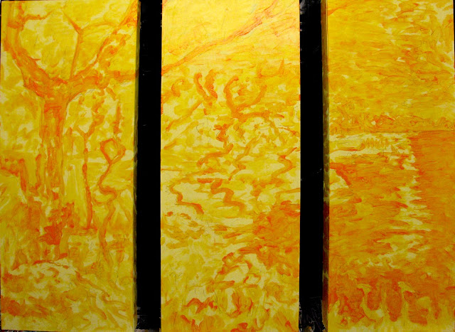
I was asked to submit a design proposal for a mural for the new 'Manitou Lodge' being finished as an addition to the Watrous Union Hospital a few months ago. I thought about the idea for quite a while before committing to anything concrete. After mulling it over, I decided to take the project in a slightly (or rather, radically) different direction than per usual. It is my general belief that an important part of visual authenticity is to base images on something borrowed from the real world. That is to say, a sketch, mock-up or photograph of the 'subject' to be painted in order to achieve that unmistakable 'visual fingerprint' of the image for a powerful reckoning for the eye and inner sensibility. I don't concern myself usually with a 'photo-realistic' rendering, though I promise you that I have the technical skills to pull that off if it is needed.
Rather, it is more important for me to create a 'visual fingerprint' of a given object so that there is a high degree of recognition without subjecting my viewer to the tedious exercise of extraordinary detail that serves no useful purpose other than to say, "Look, what a great painter I am, I can make it look so 'real'!"
For me, the reality is that this style of painting ends up suffocating the viewer with too much 'stuff' and leaves little or no room for personal dreaming and interaction. That's the rub, right there.
Sometimes less is more and it is refreshing to leave lots of wiggle room for mental and psychic navigation through the picture.
So, imagine my delight when I explained the idea for this project. Which is? I suggested that the best approach for this image would be to drift away from a picture-perfect rendering of yet another oh-so boring landscape. You can get that just by taking a stroll out of town.
Instead, I proposed that my design be entirely 'imaginary' with the aim to prevent subject fatigue...not only for the viewers but also for the guy painting. I would first create an imaginary landscape with certain abstract criteria. Namely: the colors would be soothing to the soul, the subject would be a sort of progression from complex to elegant, the design would consist of three separate panels to reinforce the idea of progression and the image would include elements from nature such as trees, sky and water. It was pointed out to me that the chapel where the artwork was destined to hang was in fact 'Ecumenical', or non-denominational. As such, I was discouraged from including any obvious religious symbolism. Sounds about right.
My inclination was to force myself to separate from my usual modis operandi by winging it by the seat of my pants. This is how my preliminary sketch (Phase 1) turned out...before I had confirmation that the project was in the bag:
Much to my delight and ( I'll freely admit) surprise, my proposal was met with open arms and soon the proposal was officially accepted by the planning committee. I was in!
Using the first mock-up as a guide, I then proceeded to paint a larger version on three separate panels. Here are the steps for Phase 2:
The panels shown in this post are 30" x 12" each, with an intentional gap between that must be filled in with the mind's eye.
I will not go into the specifics of my technique here, you can see my notes in this album.
The next step in this project (Phase 3) will be to paint larger panels (that will end up permanently installed in the Manitou Lodge Chapel) based entirely on the panels of Phase 2. The end result will be three panels each measuring 60" x 24" with gaps between to reveal the wall behind. My reasoning for this approach is to arrive at three degrees of separation from so-called 'reality'. I want to push myself to explore the arena of the sub-conscious and also to rely (heavily) on my instinctive painting abilities.
The idea of an 'Imaginary Landscape' could be called 'Imaginary Mindscape', for that is what it is.


