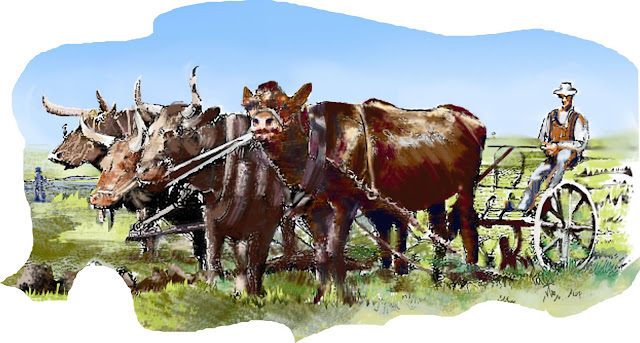
This is as important for me to see as it is no doubt for the committee.
I worked out, for the first time, the overall color scheme and composition of the entire design from stem to stern. There is quite a bit going on with this 'montage-style' mural, as I found out in no uncertain terms while galavanting about in the design process. I say 'IN the design process' because I felt totally submerged in it for the past week.
Here is what the whole design looks like in with added color:
 |
| The 'forever Young' mural will measure a total of 84 running feet in length by about 20 feet in height. |
Please note: the 'skyline' of this mural will be actually cut-out so the entire section of 'sky-blue' that I have shown in this design is intended to represent the actual sky which will be visible above the mural 'in situ'.
This added dimension will dramatically accentuate the three-dimensional effect of the figures on the horizon of the mural like a basic straight line could never do. I have gained a lot of experience from previous projects of this ilk so I know how much punch and pop this concept of a cut-out horizon delivers. It's tons more work but the outstanding results will make it all worthwhile.
 |
| One of my favorite chunks torn out of the mock-up. |


No comments:
Post a Comment