Showing posts with label Muralist Michael R. Gaudet. Show all posts

Friday, January 18, 2013

Dare to be Different...paint a mural!

Mural a Community Effort

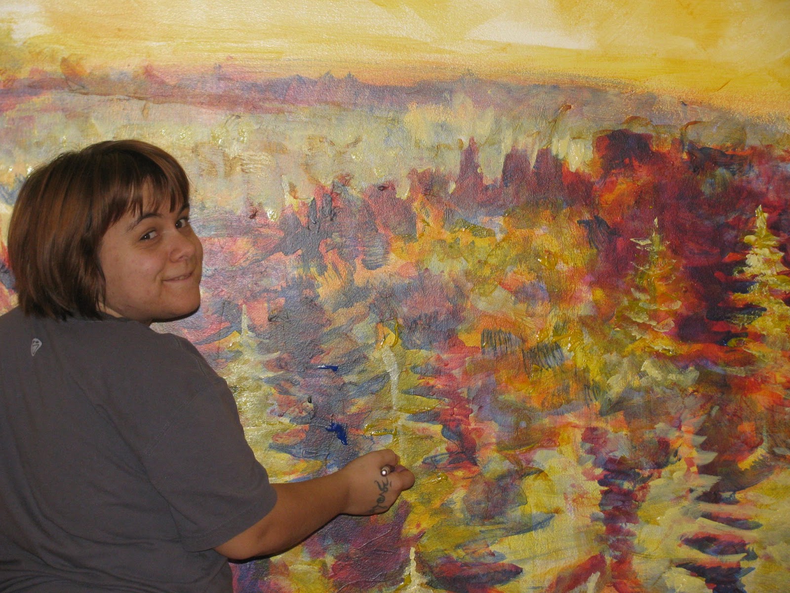
My daughter Ilara's friend Meredith Stults was invited to drop in to help push the Dare to be Different mural over the top on the last day of painting. Which was a good thing, as she dove right in to work on the deep dark shadows in the old-growth forest. Meredith clearly enjoyed herself, as was evidenced by her great, relaxed brush-strokes. Working on a large-scale mural (albeit this is one of the smaller ones; though the same general rules apply) it is critical to keep the flow of the brush-work loose and fluent. Too much 'pickyness' or tightness tends to dampen the free flow of painting on this scale, so I always encourage my proteges to stay loose, keep breathing and to go with the flow of the piece...to be 'in the moment'. 

Sprinting to the finish line with a bit of extra help.


Mural-painting technique a singular methodology

Meredith Stults readily 'took' to the mural-painting medium and methodology with just a bit of coaching. I encouraged her to think of painting the shadowy 'shapes' that were already being set up in and around the trees, rather than thinking about painting 'trees' per se. With this little tip she was off and running. I saw her brush-work suddenly loosed up and she transformed before our eyes into a confident large-scale painter. In a way, painting on this scale is like a dance that the artist has with her brush and the paint. There is a certain rhythm and flow to the application that takes on a life of its own when the artist is able to breathe and relax into her work. The physicality of painting takes a front seat with this technique.
Meredith Stults focuses intently on the rhythm and flow of her brushwork.
A well-proportioned owl fits in just right

Ilara decided early on that there ought to be an owl soaring overhead in the mural. At first we thought about making it quite large so that it would appear to be close to life-size and therefore close to 'us' in the extreme foreground of the image. After some deliberation however, we decided that the owl would look better pushed back to a place (in virtual space) where it hovered over the tree-tops of the old-growth forest. This ended up being the right choice, as it would have over-powered the composition and in doing so would've diminished the sense of scale that we had granted the central focus of the design, namely the giant Sequoia redwood. 

Ilara introduced the idea of  an owl into the composition. Here is a detail that shows it against the soft-focus background.
Mural design celebrates the rare giant Sequoia

When I first saw the picture of the rare giant Sequoia in National Geographic before Christmas, I was haunted by the image of the solitary megalith soaring so incredibly high above the old-growth forest. I wondered why there was only one in the entire vista of the photograph. After reading the article, I came to realize that the reason was simple, though ultimately ignoble. All of the others in what had one been a huge grove had been harvested over the years for lumber. Only a scant 10 % of these gigantic monoliths have survived into the modern age. This is tragic and ironic, as some of the eldest ones living today are in excess of 3000 years old. I felt blessed and honored then to have the opportunity to honor them in this small way.

Detail shows the sun setting behind the giant Sequoia Redwood, with transparent rays piercing into the shadowy depths of the old-growth forest.
One of the best shots of the Dare to be Different mural was captured by Ilara with her Android device.
Meredith Stults, Ilara Stefaniuk-Gaudet and I pose in front of the mural right after its completion in Edmonton Alberta.


Richard Preston reveals the secret life of the giant Sequoia Redwood trees in his Ted Talk

While we were working on the mural, we watched an amazing Ted Talk by Richard Preston that reveals some mind-blowing secrets of the giant Sequoia trees of northwest California. These trees are SO huge, for example, that they have been known to support permanent pools of water in their upper crotches that in turn support an exotic and diversified ecosystem all of their own including a relative of the 'plankton' formerly thought to live exclusively in the oceans. Remember, this is happening at heights of up to 380 feet ( equivalent to a 38 story skyscraper) in these magnificent trees! 


Tuesday, January 15, 2013

First Mural in First Month of 2013

A Spontaneous Brain-Storming Session

I went to Edmonton in early January 2013 to visit my daughter and after I arrived she and her housemates asked me if I wanted to do a mural on their 14' x 8' living-room wall. Or maybe I came up with the idea, the details are just a little blurry about who conjured up what but the end result of our brainstorming session was...there is a prominent crack in the wall, on the right-hand side that might be integrated into a design rather than simply mudded over. 

Suddenly, it's all about the crack

This crack ran vertically up the wall from a 1/4 inch base to a hairline at the top. Could the crack be made to feature in the design? 

A Haunting Image

I'd seen a three-page fold-out in the December issue of National Geographic that showed one of the world's tallest tree and was intrigued with the haunting image.

So I suggested that the tree, which soars to over 380 feet (38 stories) over the canopy of the old-growth forest below, be the theme of the mural...as it would doubtless create the illusion of plunging space 'within' the wall to add more dimension to the modest-sized space.

1st Mural in 1st Month of 2013

Once we had all agreed to the basic gist of the design, the project was rapidly launched by the first 'study' glaze to start the separation of light from dark.

The first sketchy orange glaze will quickly separate the light from the shadow.
In this case, the best way to proceed was to paint directly onto the wall with a large brush, unaided by a preliminary sketch in pencil. This is a great way to keep a composition fresh and vibrant, as it becomes a record of the 'physicality' of the brush-strokes or a recording of the artistic process in its raw form.

You can see where the crack in the existing wall becomes a visual and even tactile anchor for the positioning of the giant Sequoia that springs up and high above the lofty heights of the old-growth forest canopy far below. 

As usual, the job at hand is to separate the light from the dark. The dark must be a foil for the objects of light. so it makes sense to paint at first the designate 'negative space' or the darkness where objects appear as light against a dark surround. Conversely, when an object is seen as a dark shape set off against a lighter field, it must be perceived as a 'positive'. 

The early glazes are kept lively and fresh to  be later clarified to a certain degree using as the mural-painters approach of large fluid strokes.


Keeping the early glazes fresh as large, loose and free-flowing as possible to coax out the images with as much expression as desired. Subsequent glazes will provide ample opportunity to refine the visual fingerprints until they ring with authenticity.


You can see the giant Sequoia towering above the canopy of the old-growth boreal forest with just the first three glazes in progress. What is dark? What is light? Herein lies the difference.

It's called "global glazing" for a reason. Each progressive glaze is applied throughout the entire mural as required so that the whole wall progresses in a wave. There would never be 'micro-managing' of isolated details, rather everything is painted with equal attention continuously.

Ilara Stefaniuk-Gaudet was largely responsible for the 'negative space' in the old-growth boreal forest . 

Ilara Stefaniuk-Gaudet was largely responsible for the 'negative space' in the old-growth boreal forest and beyond whereas I had set it up with those first few defining glazes. Much more to come! 


Only the top of the crack was left visible from the base of the giant trunk where it emerges from the depths of the canopy. Beneath this the crack is filled.

I requisitioned a pail of crack-filler to BURY the crack-in-the-wall below the visibly lower trunk of the giant Sequoia. That way, it would appear to spring out of the canopy, invisible in the old-growth boreal forest. Beneath this the crack is filled and buried to enhance the visual oomph of the integration of the self-same crack into the texture of the ancient trunk above to its very tapered tip. Working with the anomaly of the surface can yield stronger results than merely covering them over, in some cases.


Everything is painted on a larger scale in mural-painting as this close-up of Ilara working on the negative space shows.

The mural-painting technique is specific in that everything is painted with larger-than-life strokes. Anything else would defeat the purpose of the medium and genre. While a mural may certainly look lovely at close inspection, the visual impact must be greatly enhanced at a distance.

Building, always building transparent glazes until the 'negative space' is positively separated from the light, leading to 'native' or local colors.

There's nothing like a pre-booked return train ticket to ensure that a project stays on a tight schedule. Stay tuned for the following post in the next couple of days that will show the mural being completed along with a more in-depth look at the meaning(s) embedded in the 'Dare to be Different' mural...

Saturday, September 8, 2012

Sprinting to the Finish Line


Now that the so-called 'full-spectrum tonal study' is nearing completion, I can start adding the 'native' or 'local' colors. In my opinion, the advantage of using the 'full-spectrum tonal study' throughout the entire composition BEFORE committing to local color is that this approach lends an overall continuity and warmth to the painting. No part of this mural appears isolated from the rest; rather, the whole things hangs together as a unified field.


The richness of the shadowy parts in contrast with the highlighted colors is really apparent as the steam locomotive comes into sharp resolution.


The cluster of figures is now about ready for 'local' color after the last treatment with pthalo blue strengthens the shadows. At this point all of the colors represent only the 'full-spectrum tonal study'. No effort has yet been expended in introducing the actual colors of the clothing or flesh tones. That will take place in the coming days so wait for it. You will see quite a radical transformation as it progresses.


The horse and buggy now stand out in sharp contrast from the background (more muted) colors. Also, the perspective of the horse creates a convincing illusion that he is popping out of the surface.


The parade of vintage vehicles begins to come into its own as increasing contrast and resolution (those two elements seem to go hand-in-hand with this technique) begin to enhance the three-dimensional dynamic.


A more distant shot of the parade shows the marchers along with historic downtown Young...with the seemingly gigantic cows calmly overlooking the scene. I wonder what they are thinking?


Backing up even further to show the relationship between the horse and buggy and the parade. The diving perspective is accentuated by the sweeping lines of both the parade route and in opposition...the horse's torso that proudly stands in front of the letter 'N'.


Looking back on the lower section of the mural towards the end of the work day.


I think the fairly busy collage of shapes is sorting itself out quite nicely at the lower right-hand side of the composition.


Turns out that the two portraits of our honored WWII vets will be every bit as prominent as the weathered figures at the upper left-hand side of the mural. I was a bit surprised at how large and eye-catching these two figures ended up being. Sometimes it really is difficult to anticipate how things will look until they show up on the wall.


Just modeling the various textures in this vista that shows a clerk at the 'Bean Farm' operation. Again, I was just a bit surprised at how prominent this figure turned out to be. He nicely anchors the middle right-hand side of the composition.


The parting shot of the lower section of the mural shows how the overall continuity holds the composition together in a coherent fashion. Even with such a complex phantasmagoria of shapes and colors there is certainly a visual and conceptual order.

Wednesday, August 29, 2012

Purple Glaze all in my brain...


Advancing with iron-willed determination with the remaining few square meters of red glaze...already anticipating the rush of 'purple glaze'...


There. That should just about do the trick for the application of the translucent red glaze. Time to crack open my ( probably ) most favorite glaze...purple! Or, more accurately, dioxazine violet if you want to be exact.


Can you spot the encroachment of violet?


Everything really pops with the addition of a translucent violet glaze. Suddenly the shadows start to make themselves known and the earthiness of these first three glazes with all of their infinite intermingling becomes apparent.


You can see the steam engine grows bolder and more powerful looking with the addition of violet. Maybe I am getting just a bit ahead of myself but I thought I would have a little fun with some steely blues to create the beginning of an impression of reflective iron on the front of this huge machine. Rules? What rules? It still has to be fun!


The composition of the first several objects starts taking shape with the gradient blue bits adding incredible depth and perspective.


There's something about atmospheric blue that intrinsically suggests depth and atmosphere. I think our brains via our eyes are hard-wired to accept this color as meaning "far far away", especially when it is a graduated tone from quite light on the bottom to rich as it ascends into space.


The cluster of figures just to the right of the train begin to dramatically come into their own once the violet glaze is applied. This glaze interacting with the previous red and orange glazes set on a base of golden flesh color begins to set up a dynamic surface tension that starts to convince the eye that the various shadows, highlights and contrasting shapes are surprisingly life-like.


Progressing to the right with the violet glaze forces the images to stand out in vivid contrast to their so-called 'negative space'.


I usually start my day with a certain goal in mind. This picture was taken yesterday...the goal was to to tease out the horse and buggy from the background and also to tidy up a variety of smaller details. Mission accomplished!


You can see the steady advancement of the violet glaze popping features out of the golden-flesh field.


One final parting shot from up on the sixteen foot step ladder...we have been here before! I think one more day will suffice to finish the purple glaze. Then it's on to...pthalo blue. Just wait, you will see the shadows and contrast pretty much leap off the page with the blue. But you already know that if you have been following.


One added pleasure for me while working away on the mural is when visitors pop in to check out my progress and (in general) cheer me on...as this is truly a marathon of painting. I try not to think too much about the formidable scale of this piece and just stick to the program...paint, paint, paint. Rest, drink, snack, paint, paint, paint.

Thursday, August 16, 2012

Red Red Red and then more Red


While it is a somewhat slow and meticulous process, the 'red glaze' steadily blooms across the eighty foot span of panels. You can just see the man's torso emerging inside the letter 'O'.


The scaffold is rolling, rolling, rolling across the wall as the red glaze is methodically applied. There is really no rushing this process...each glaze must be patiently added in a certain order to achieve the full-spectrum tonal treatment that will ultimately lead to the final glazes of 'local' color which will cinch the process.


The red glaze defines the character and depth of this group of figures quite dramatically, coaxing them out of the long slow simmer of their ethereal existence trapped within the confines of the mock-up for the past two years. I am enjoying the daily progress of realization that is bringing them and the rest of this sprawling menagerie of characters and events to life.


Not showing any signs of slowing down yet as you can see by the blurry right hand wielding the magic brush


Goofing around with my friend the formidable Miss Lizzy G at the far right-hand side of the first ( ie: upper) set of panels which now form a semi-circle at their temporary resting place in the curved corner of the hockey rink at Young, SK., which is serving as my summer studio.


Working on the beginning of the 'Jubilee Street Parade' which will eventually feature quite prominently in the lower center of the composition. I like this scene because the vintage cars parked along Main Street Young create a strong time-based impression of years gone by. This adds to the overall theme of historic Young and also presents a dramatic, plunging depth of perspective that accentuates the three-dimensional illusion of the design.


Betty, Lizzy G and Marnie pose alongside the almost life-size team of oxen. We were laughing about the fact that once the mural is up on its permanent mount outside, these beasts will be soaring about twenty feet up in the air. So it will be a bit more difficult to get up close and personal at that point.

Wednesday, August 15, 2012

Ready to Rock the Red


With each successive glaze, the contrast grows stronger but just as important so does the resolution. And the red glaze is no exception...in fact it is one of the most powerful defining moments in the evolution of the mural.

The images are no longer merely amorphous...rather, at this stage the strength and character of the brushstrokes becomes abundantly obvious. It's a 'do or die' situation when it comes to the red.


The previous glaze (orange) needed to be applied super carefully, because the only guide was the 'plot point' sketch created with pencils. It was time-consuming to the utmost, due to the fact that it felt like a high wire act without a net, as the very sketchy guide lines do not help a whole lot in shoring up confidence. At that point I was heavily reliant on the dossier of source photos for reference. But now that the base glaze of orange is successfully applied, I am more free to fly with my brushes dipped in the powerful cadmium red medium.


As was the case with the orange glaze (as I pointed out in my previous post) it is paramount to make every brush stroke count, as these early glazes set the mood and template for all of the future glazes that will ultimately land us at the finished product. If you look carefully you will see that there is a lot of character and personality in the brushwork that defines the details and textures of the railway station. Even at this early stage.


I like the way that the railway station nicely anchors the lower left-hand side of the composition while forming a solid gravity that stitches it to the other buildings that sit at about 2:00 directly above and to the right. As I am just seeing it for the first time in the mural, I appreciate now that my design instincts were right on the mark with the scale and composition in this case.


You can see that the massive steam engine is rapidly coming into resolution with the addition of the red glaze. Although it will be a few days yet, I can already imagine how imposing it will appear with the following glazes: violet, pthalo blue, etc. Can you spot the two figures just beginning to emerge? They are there to establish the scale of the steam engine, incidentally the very first to pull into the rail-yards at Young back in the mid 19-teens.


What you are seeing is the result of almost a full day's patient glazing as I work methodically from left to right in two passes of about 4-5 feet swaths. If all goes well, I oughta be able to finish this stage in two or three more long days and then it's on to what is maybe my favorite glaze...violet. So stay tuned!